.png)
Tapioca Co.
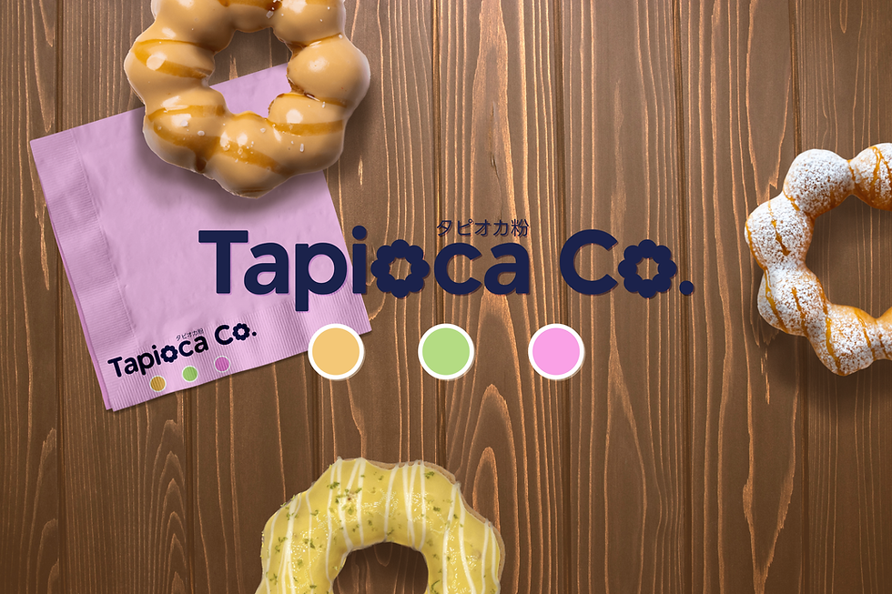
Tapioca Co. is a conceptual brand that brings the soft, chewy delight of Japanese mochi donuts to life. The name itself is a playful fusion of languages—rooted in the key ingredient, tapioca flour, known in Japanese as タピオカ粉 (Tapioka-ko). For this project, I crafted a bold yet modern identity that reflects the fun, light, and indulgent nature of these uniquely textured treats. The logo balances clean typography with subtle circular elements, echoing the signature shape of mochi donuts. The colour palette is inspired by their vibrant flavours, using soft pastels and deep navy for contrast and sophistication. The packaging system includes three distinct box sizes—4-pack, 6-pack, and 12-pack—each designed to be both functional and visually engaging. Playful organic shapes, minimal yet striking layouts, and thoughtful branding details create an experience that feels premium yet approachable. Custom tissue paper and branded napkins complete the aesthetic, making every unboxing moment as satisfying as the donuts themselves. This project is a visual celebration of flavour, texture, and culture—bringing a fresh take on Japanese mochi donuts through considered design and strategic branding.